Just a quick update to redirect you.
1. I have a new Tumblr
site where I'll be posting a lot more pictures, a lot less text, and a
lot more often. I'm slowly making the move away from this blog to
something that's a little easier to use and update. I'm not deleting
this blog, just moving to a new one.
2. My Website
has been updated and now includes a section for the new body of work
I'm doing under "Artwork- The Suburbs." Also, the "Artist" section has
an updated biography.

Thursday, April 3, 2014
Saturday, January 25, 2014
From Tamarind to Takach- the Final Months in ABQ
So... my last update left off with a promise of more results from my senior research project on Century Plates. Long story short- the results with the other two resurfacing methods were pretty terrible and I was a little disheartened about writing about it. Instead I'll just say, if you want to use these plates, just resurface them using grit and a sanding sponge as outlined in the last post- they still take only a few minutes to resurface and can be reused over and over with decent results. The good news is that I've used them pretty extensively for a few prints I've done recently in grad school (oh yeah, I'm in grad school now!) and they seem to be holding up well, but I'll get to all that later. There's a lot to cover in between.
 My last few months at Tamarind saw a few more visiting artists including Liliana Porter (who was kind and sweet and made a collection of prints with adorable little rabbits) and the whirlwind of amazing that was Charles "Chuck" Arnoldi. Bill and I made nearly 90 plates (layers) for Chuck in the span of a week and a half during his visit, and printed all day every day trying out different colors, combinations and layers. It was an insane amount of work, but the results were phenomenal.

Tamarind recently published a few of them and I just found out he named each one after characters in Breaking Bad, which is just awesome (one of the ones he and I worked on is titled "Heisenberg"). Here's a link to some of the pieces Chuck made during his visit. Lunch breaks and post-work ice cream visits were spent listening about Chuck's amazing travels around the world, adventures he's been on, books his wife had written and her time as a competitive female bodybuilder, and other incredible people he's met. In addition to being a wildly talented artists he was also near the top of my list of interesting people I've met.
Finally, the last month or so saw another major project at Tamarind, known as the Landmarks project. Four Native American artists and three Aboriginal artists came to the workshop and instead of working with Bill and I (because that's a -lot- of artists in a short amount of time!) the printer training program students were invited to participate and Bill, Rodney and I just helped out, and after so much work over the last year it was really nice to take it kind of easy. Artists involved in the project included Dyani White Hawk (image 1 below), Jewel Shaw, Marie Watt and Chris Pappan (image 3) from North America, and Marie Josette Orsto, Alma Granites (image 2), and Djirrirra Wunungmurra from Australia.


 Around the end of my time at Tamarind they had a fantastic graduation ceremony for the PTP students and myself. It was a fantastic night and everyone was really proud of all the hard work we'd done. Bill even got me a trophy! Turns out I now hold the record for the most editions printed by a second year senior printer, which is pretty cool. I realize I'm glossing over a lot of what happened, but it -has- been a while.
After my time at Tamarind was done I was fortunate enough to be able to work at Takach Press for my last few months in Albuquerque. To say it was a fantastic time would be a gross understatement. Takach is very much a family oriented business and they invited me in as a member of their amazing family, which was great. They even invited me to great family functions and one -very- memorable trip up in Keith Takach's hot air balloon, which very well might go down as my favorite day in Albuquerque, and a great send off to head back to the Midwest.


Tamarind recently published a few of them and I just found out he named each one after characters in Breaking Bad, which is just awesome (one of the ones he and I worked on is titled "Heisenberg"). Here's a link to some of the pieces Chuck made during his visit. Lunch breaks and post-work ice cream visits were spent listening about Chuck's amazing travels around the world, adventures he's been on, books his wife had written and her time as a competitive female bodybuilder, and other incredible people he's met. In addition to being a wildly talented artists he was also near the top of my list of interesting people I've met.
Finally, the last month or so saw another major project at Tamarind, known as the Landmarks project. Four Native American artists and three Aboriginal artists came to the workshop and instead of working with Bill and I (because that's a -lot- of artists in a short amount of time!) the printer training program students were invited to participate and Bill, Rodney and I just helped out, and after so much work over the last year it was really nice to take it kind of easy. Artists involved in the project included Dyani White Hawk (image 1 below), Jewel Shaw, Marie Watt and Chris Pappan (image 3) from North America, and Marie Josette Orsto, Alma Granites (image 2), and Djirrirra Wunungmurra from Australia.
Around the end of my time at Tamarind they had a fantastic graduation ceremony for the PTP students and myself. It was a fantastic night and everyone was really proud of all the hard work we'd done. Bill even got me a trophy! Turns out I now hold the record for the most editions printed by a second year senior printer, which is pretty cool. I realize I'm glossing over a lot of what happened, but it -has- been a while. After my time at Tamarind was done I was fortunate enough to be able to work at Takach Press for my last few months in Albuquerque. To say it was a fantastic time would be a gross understatement. Takach is very much a family oriented business and they invited me in as a member of their amazing family, which was great. They even invited me to great family functions and one -very- memorable trip up in Keith Takach's hot air balloon, which very well might go down as my favorite day in Albuquerque, and a great send off to head back to the Midwest.
A few days later I packed up and Brody and I took another cross country trip to DeKalb, IL where I was to start graduate school at Northern Illinois University, but that's another full post, and this one's getting a bit full. So, til next time!
Tuesday, March 19, 2013
Century Plates- Senior Research Project
(This post is going to focus heavily on technical aspects of lithography. You've been warned.)
 |
| The plate on the press after roll-up |
In addition to the near constant visiting artists and editioning in my spare time I’ve been working on my senior research project. Each
Tamarind master printer candidate chooses a subject that they will study and
write a report on during their training period to be completed in addition to
working with artists. Around the time I started Dwight Pogue from Smith College
in Massachusetts had mailed us a few Century Plates to try out. Century Plates
are a relatively new product Pogue has been developing for some time that are
thicker than aluminum plates, available in a variety of sizes, and are supposed to be re-grainable hundreds of times and hold all the detail of a
regular ball-grained aluminum plate. Needless to say, this would greatly reduce
on the cost (especially to students) while doing multiple run lithographs and
at the cost of nearly one aluminum plate they practically pay for themselves.
Pogue and his students have been testing the plates for some time now using
Pogue’s other products to process the plates (namely, BioSolut as a replacement
for lithotine and acetone, and BioLac for a shellac/lacquer base). I wanted to make sure
that traditional materials like lithotine and traditional shellac worked just
as well.

What is also pretty awesome about these plates are the three
different ways they can be resurfaced to hold images. The plate can be
“renewed” by removing the old image with lithotine, rubbing with Bar Keeper’s
Friend for a few minutes, rinsed, and rubbed with an abrasive sponge with a
little pile of each kind of grit (80 through 220), and abrading the surface to make the plate
like new. It can be “restored” by removing the old image with lithotine, and
rubbing with Bar Keeper’s Friend, rinsed, and rubbing with just the abrasive
sponge (80 to 220 grit depending on what kind of image is desired). It can also
be “refreshed” by removing the old image with lithotine, and rubbing with Bar
Keeper’s Friend.


Material tests on the plate before etching and first roll-up
My plan is to try each type of resurfacing with a variety of
drawing material: Korn’s pencil 1-5, Stone’s pencil 1-5, Korn’s crayons 0-5,
autographic ink, Stone’s tusche concentrate with a dark, medium and light wash,
Korn’s rubbing crayon in hard, medium and soft, spray paint, sharpie marker,
and industrial sharpie marker. The same materials will be used on each
resurfacing, starting with a “renewed” surface, with a small edition (20
sheets) being pulled in black with a leather roller, and again in red using a
composition roller.
So far I’ve tried the “renew” method, since the plate that I
received was new without an image on it, I cleaned and grained it according to
Pogue’s method just to ensure it was at a proper “renew” state. My first concern was how incredibly smooth the surface was, despite ‘graining’ it. I
knew immediately that water retention was going to be a challenge, especially
at Tamarind, which not only is in a desert, but also has a ventilation
system that keeps fresh air circulating. My first etch was straight tannic acid, moved around for a
few minutes before being buffed in. After an hour the ink was removed with
lithotine and put into a butyl based shellac that we’ve been using at Tamarind
with success for a few years.
When I rolled up the image I was very pleased with how the
pencil and crayon bands looked. The spray paint and rubbing crayon all went
darker, but I wasn’t too concerned, as that’s pretty typical for those
materials. I had, during mixing, ruined the tusche washes, so I wasn’t too
concerned with those, except for the concentrate flat area. Overall, I was
pretty impressed. I etched it a second time using more traditional method,
since those few areas did go a little dark- gum Arabic over the lights, 50/50
over most of it, and Tapem over the darks. The areas that had gone dark I
etched with Tapem mixed with a few drops of phosphoric acid.

 The true test, however, came in printing the edition. I
wanted to make sure the edition held up during printing, didn’t gain or go dark
in areas, and didn’t scum in the non-image areas. The first few impressions I
pulled looked good except for the darkest areas, which appeared salty. I upped
my pressure a little, added a little more ink, a few more passes in the dark
area and eventually got it to print full. As I suspected I was also having a
lot of problems with the plate drying out extremely quickly. I ended up having
to use a good amount of glycerine in the water to relax it and reduce the dry
out time on the plate. I did notice, too, that the more impressions I pulled,
the more the light areas of my plate were gaining. A quick rub of the area with
my fingertip cleaned it up, but it was a pretty continuous battle, even with a little 50/50 in my water bowl. About half
way through the edition, and after talking with Pogue, I massaged the plate
with some tannic acid to try and clean up the light areas. It seemed to help a
little in the lightest areas, but the mid-to-light areas were still a little
bolder than the original drawing and the first few impressions I pulled.
The true test, however, came in printing the edition. I
wanted to make sure the edition held up during printing, didn’t gain or go dark
in areas, and didn’t scum in the non-image areas. The first few impressions I
pulled looked good except for the darkest areas, which appeared salty. I upped
my pressure a little, added a little more ink, a few more passes in the dark
area and eventually got it to print full. As I suspected I was also having a
lot of problems with the plate drying out extremely quickly. I ended up having
to use a good amount of glycerine in the water to relax it and reduce the dry
out time on the plate. I did notice, too, that the more impressions I pulled,
the more the light areas of my plate were gaining. A quick rub of the area with
my fingertip cleaned it up, but it was a pretty continuous battle, even with a little 50/50 in my water bowl. About half
way through the edition, and after talking with Pogue, I massaged the plate
with some tannic acid to try and clean up the light areas. It seemed to help a
little in the lightest areas, but the mid-to-light areas were still a little
bolder than the original drawing and the first few impressions I pulled. 
The images to the side illustrate three sheets pulled from the
edition- number 2 (top or left), number 10 (middle), and number 18 (bottom or right). Number 2
indicates most closely what the original plate looked like after the initial
roll up, number 10 illustrates the light areas gaining the most before the
massage with tannic acid, and 18 illustrates how the tannic acid had improved
the lightest areas.
After pulling the twenty sheets in black ink, I changed out
my slab for a Hanco Master Palette Dark Red. Overall, the results were pretty
similar to the end of the black edition after the tannic acid massage. I still
had some areas where it tended to gain (click for a larger view), but nothing too serious.
 |
| The ghost image on the "refreshed" plate |
After the edition was pulled in the red ink I decided to go
to a “refreshed” state by removing the ink with lithotine, acetone and denatured
alcohol to remove the butyl shellac base, and rubbed the plate with Bar
Keeper’s Friend. The previous image was still a little bit visible, but I wouldn't say it was enough to perfectly trace over. I transfered my previous grid and laid down the same materials as the first test.
I etched all the materials with tannic acid right before leaving Albuquerque. I'm really curious to see how this "refreshed" plate prints, and if the previous shellac base interferes with the new material.
At the moment I'm sitting in Chicago in a Starbucks, only a day away from the SGCI conference in Milwaukee. If you're interested in these plates, Pogue's students will be doing a demo at the conference on them. If you can't make it up to Milwaukee, you can also check out his website for more information, and even catch a video on YouTube of one of the plates being printed.
I'll keep you all updated on my progress! Despite a few little hiccups, I still think these plates have a lot of potential, and I'm excited to use them in my own work soon.
Saturday, March 16, 2013
Recap!
Wow. What a(n almost) year it's been.
Let me start from the beginning. After graduation in May, I had a month to re-coop, relax and prepare for what would prove to be an amazing and busy couple of months. I had a day in June to move everything in, clean and organize my press station, and get settled before we had two artists in. The previous year Tamarind had attained funding for a large project that would span a month and a half. Usually it's typical to have just one artist in at a time for one or two weeks. In June and the first two weeks of August, we had two artists in at a time for two weeks each to participate in "Afro: Black Identity in Brazil and America." Three artists of African descent from Brazil, and three from North America were paired up to create work that addressed their heritage and identity as black individuals. Needless to say, it was a huge undertaking, and thankfully Asa Wentzel-Fisher, one of the senior printers from the previous year stayed on for an extra month to help with the first four artists. A group of filmmakers came in to document the collaborations and put out this video about the experience:
The first pair was Alison Saar (USA) and Rosana Paulino (Brazil). I ended up working exclusively with Alison on a large diptych piece where two prints were created, sewn together, and a second layer was printed on a thin Japanese paper, hand cut, painted, then adhered to connect the two. The project was extremely exciting and rewarding, and certainly more challenging than most of what I had done during last year.
 Alison was an absolute joy to work with, full of ideas, and an extremely hard working artist. Although I didn't get to work with Rosana, I did get to have some nice sit downs and chats with her, and concluded that she was a fantastic, warm-hearted woman, also with great talent.
 After two weeks Willie Cole (USA) and Tiago Gualberto (Brazil) arrived. Tiago was an absolute joy to work with- energetic, bursting with creativity, and willing to work extremely hard. Willie was very kind, thoughtful, and deliberate about the work he created. Willie's work focused more on self identity, where Tiago's emphasized black identity as a larger overarching theme.
 Tiago ended up with two prints of paper dolls (or "Pay per dolls" as he titled them), one male and one female that offered a main iconic black figure from classic paintings with different modern clothing that could be cut out and overlayed over the figure. For example, the female one had a central figure and then an outfit to make her look like Oprah Winfrey. He also did two prints of money, one Brazilian note, and one five dollar North American note. For fun he also created a sculpture and several drawings as well. Willie ended up with two personal crests using items that he identifies with, and that have been used numerous times in his work before such as irons, ironing boards, women and fancy shoes. Both finished prints ended up very vibrant and colorful. Or "zippy" as Rodney might call them.
 The third and final pair of Sidney Amaral (Brazil) and Toyin Odutola (USA) came a month later during the first two weeks in August. These two were also an absolute joy (notice a theme?) to work with. Toyin was lively, friendly, exuberant and extremely talented. Her work is a twist on classic portraiture. Toyin takes images of herself, family and friends, lays down a vibrant pattern of colors, then goes over the top with black, creating a finely-detailed, muscle-like structure that blocks out most of the color, except where it shines through, creating a woven like texture over small strips of vibrant color. The results are phenomenal, creating an intricate, beautiful pattern that speaks of a depth and beauty rarely seen in most portraits.
Sidney was absolutely amazing as well- kind to a fault, warm-hearted, easy to laugh, and a terrific draftsman. Sidney and I worked on two prints together, both using small areas of color with beautiful drawings on top. Sidney's work utilized elements of Yoruba tradition and mythology, as well as objects associated with Brazilian culture. Some of the best times, though, were the last day these two were here, when we got to take the day off and travel up to Santa Fe to look around and do some touristy things like trying on silly hats, and window shopping. Toyin has a great tumblr account, and back in August documented her time at Tamarind. Overall, the project was a great experience. It was a lot of work, but it was great collaborating with such fantastic people, and creating some really amazing prints. The video above shows interview with all of these artists, statements about their work, and a rare glimpse at all the prints that were created during their time here. Not all the prints are up for sale yet, but will be soon on Tamarind's website if you're interest in any of them.
The month of July was especially exciting. Bill went up to Washington to print with Jim Dine for the month, which meant I got to work exclusively with any artist that came in, hang out with the summer workshop group, and catch up on printing some editions. For a few days we had Jean Baptiste Apuatimi, her manager Steve Anderson, and Steve's daughter Lily in the studio. Jean was from the Tiwi Islands, off the north coast of Australia, and was one of the eldest indigenous artists working in the area. She and Steve and Lily traveled to New Mexico because Jean had several of her paintings in a show in Santa Fe. Since they were relatively near Tamarind, Jean was invited in to create a few prints despite only being there for a few days. This meant we had to work quickly, which was no problem for Jean! In the short amount of time she was here we worked on five prints, proofed on a few different papers. The four prints we ended up editioning also had to be finished before Jean left the country, which left me with my work cut out. I was happy to do it, though, and Jean, Steve and Lily were wonderful company, and it was great to learn about Jean's community. Around the end of their visit I took a trip up to Santa Fe to see the opening of the show at Chiaroscuro where Jean's paintings were being shown. It was tradition for an elder of the community to "dance in" a welcome for the paintings, and Jean performed this dance.
Another fantastic part of July was getting to meet the aluminum plate summer workshop class. Like the printer training program, this class is open to eight students (though this year only had seven) and they come from all over the world to take a month long class from Rodney. I never got to participate in this class, so it was interesting to see the difference between the summer class, and the printer training program. I think the biggest difference was the sheer amount of demo's the summer class had! Every day it seemed like a new demo. With no deadlines or projects there was a much more relaxed atmosphere to the whole thing. The group was more international than our PTP class as well, with two girls from Australia, one from Ireland, one from Canada, and three from the USA. Everyone was enthusiastic, excited to be there, and willing to work hard every day. It was a lot of fun getting to know all of them.
One of the funniest things was seeing this!:
 Look familiar? One of my very first blog posts covered steam roller printing at the Plains Art Museum in Fargo. Dave Machacek, a member of ArtOrg in Northfield, MN participated in the summer class and brought in this little beauty. In the pictures from my early blog post Dave is the one driving the steam roller. What a small world, right?

The end of July was spent working with Alex Cerveny, a lovely Brazilian artist who made some beautiful, delicate drawings with me and Bill. Here he is with his awesome magnifying headpiece working on Nasografias. Here's a link to show the finished project, as well as the print Alex and I worked on entitled Human Nature.
The following month or so after Toyin and Sidney left was dedicated to catching up on printing editions, including the work from the Brazilian project, and a few gigantic prints Nicola Lopez had created earlier with senior printers from last year Alex and Asa. Did I mention they were huge? Because they're huge. And amazing.

When we had mostly caught up on pulling editions Bill and I decided to tackle one of our biggest obstacles, a 48 page book (12 sheets, printed front and back, and folded in half= 48). Thankfully the planning, layout and most of the plates were already finished, which just left pulling the editions. One of the challenges, though, was making the book cohesive despite two printers (me and Bill) printing it. This meant that Bill had to match my ink film, and I had to match his. It was a huge undertaking that took about two months of each of us printing every day to complete. The end results were stunning. The book is still in the process of being bound and finished, so I don't want to post too much about it. I will, however, show you how happy Bill was when the last page was completed.
Sooo happy!
 One of my favorite encounters (in an long list of favorite encounters) was meeting Gendron Jensen, a contract artist who has been coming to Tamarind for many years. His work is jaw-dropping gorgeous, detailed and intricate. Gendron draws bones, exclusively, often collecting his own specimens in the field, and arranging them into new shapes. The three prints on the table in this picture is the triptych he created during his most recent visit, depicting a representation of King Arthur (middle) and two of his most trusted men (on either side) using wolf bones. Gendron is one of the kindest people I have ever encountered in my lifetime. We had many conversations about the importance of love, creativity, and appreciating the little things in life. I know many of the students were also impressed and touched by his warmth and good-naturedness during his visit.
 Gendron was the last artist of 2012 that I worked with. 2013 has already brought with it three new artists- Chris Ballantyne, Matt Magee, and Allison Miller. Along with the ocassional monoprint artist, a large research project and a side project with Garo Antresean, I've definitely been keeping busy.
Chris was only able to stay for one week, instead of the usual two, but in that time still managed to create a large five color print, and four two color smaller prints. A good amount of work for just a week! I was really drawn to Chris's work. It had a kind of quiet surrealism to it, and was fairly minimalistic while still being representational.
 Shortly after Matt Magee visited and brought with him a whirlwind of printing. Matt knew exactly what he wanted to do, and was willing to work hard with Bill and I to get it all finished. In the two weeks he was here we created -EIGHT- prints with Matt! Here's an image with three of them completed on the wall, which Bill, Matt and I look at the outline for another 12 color image. Matt had a great sense of humor, was extremely kind, and was another one of those artists just bursting with creativity, making not only a ton of prints, but filling his time by making other drawings, paintings, and even some small sculptures in his free time.
The latest artist I got to work with was Allison Miller, an abstract painter out of LA, who often incorporates pattern or almost decorative elements and combines them with a large overlaying object (often black or dark) that covers up a portion of the image. Like this one for example. Allison doesn't plan out her paintings, and works very intuitively, which was very interesting to watch. She was a lot of fun to work with, and had a great, easy to get along with personality, which makes any collaboration a joy. Allison and I ended up working on a large 12 color print during her visit, while she worked with Bill to create several monoprints utilizing acrylic paintings and printed elements. Unfortunately I don't have any pictures from her time here. She was a little camera shy, and I respect that.
Well, that's about it for collaboration update! Like I said, the next few months should be just as busy and exciting. Check back in a few days for an update on my research project (re-grainable Century plates from Dwight Pogue) and in a few weeks for a recap of the Southern Graphics conference in Milwaukee, WI. It's my first time attending an SGC conference, and I'm really looking forward to it!
*please note, most of these images were used with permission from Tamarind Institute's Facebook page, please do not re-use them without permission
Let me start from the beginning. After graduation in May, I had a month to re-coop, relax and prepare for what would prove to be an amazing and busy couple of months. I had a day in June to move everything in, clean and organize my press station, and get settled before we had two artists in. The previous year Tamarind had attained funding for a large project that would span a month and a half. Usually it's typical to have just one artist in at a time for one or two weeks. In June and the first two weeks of August, we had two artists in at a time for two weeks each to participate in "Afro: Black Identity in Brazil and America." Three artists of African descent from Brazil, and three from North America were paired up to create work that addressed their heritage and identity as black individuals. Needless to say, it was a huge undertaking, and thankfully Asa Wentzel-Fisher, one of the senior printers from the previous year stayed on for an extra month to help with the first four artists. A group of filmmakers came in to document the collaborations and put out this video about the experience:
 |
| Alison and Rosana working on a collaborative piece. |

 After two weeks Willie Cole (USA) and Tiago Gualberto (Brazil) arrived. Tiago was an absolute joy to work with- energetic, bursting with creativity, and willing to work extremely hard. Willie was very kind, thoughtful, and deliberate about the work he created. Willie's work focused more on self identity, where Tiago's emphasized black identity as a larger overarching theme.
 Tiago ended up with two prints of paper dolls (or "Pay per dolls" as he titled them), one male and one female that offered a main iconic black figure from classic paintings with different modern clothing that could be cut out and overlayed over the figure. For example, the female one had a central figure and then an outfit to make her look like Oprah Winfrey. He also did two prints of money, one Brazilian note, and one five dollar North American note. For fun he also created a sculpture and several drawings as well. Willie ended up with two personal crests using items that he identifies with, and that have been used numerous times in his work before such as irons, ironing boards, women and fancy shoes. Both finished prints ended up very vibrant and colorful. Or "zippy" as Rodney might call them.
  The third and final pair of Sidney Amaral (Brazil) and Toyin Odutola (USA) came a month later during the first two weeks in August. These two were also an absolute joy (notice a theme?) to work with. Toyin was lively, friendly, exuberant and extremely talented. Her work is a twist on classic portraiture. Toyin takes images of herself, family and friends, lays down a vibrant pattern of colors, then goes over the top with black, creating a finely-detailed, muscle-like structure that blocks out most of the color, except where it shines through, creating a woven like texture over small strips of vibrant color. The results are phenomenal, creating an intricate, beautiful pattern that speaks of a depth and beauty rarely seen in most portraits.
 | |
| Bill and I pulling the last run on Sidney's proof |
 |
| Steve, Jean, Marge, me, and Lily with Jean's prints |
 |
| Jean "dancing in" the paintings at Santa Fe's Chiaroscuro |
 |
| Summer class 2012 |
One of the funniest things was seeing this!:


The end of July was spent working with Alex Cerveny, a lovely Brazilian artist who made some beautiful, delicate drawings with me and Bill. Here he is with his awesome magnifying headpiece working on Nasografias. Here's a link to show the finished project, as well as the print Alex and I worked on entitled Human Nature.
The following month or so after Toyin and Sidney left was dedicated to catching up on printing editions, including the work from the Brazilian project, and a few gigantic prints Nicola Lopez had created earlier with senior printers from last year Alex and Asa. Did I mention they were huge? Because they're huge. And amazing.
 |
| Printing the last run on a 12 color print for Nicola Lopez. |

When we had mostly caught up on pulling editions Bill and I decided to tackle one of our biggest obstacles, a 48 page book (12 sheets, printed front and back, and folded in half= 48). Thankfully the planning, layout and most of the plates were already finished, which just left pulling the editions. One of the challenges, though, was making the book cohesive despite two printers (me and Bill) printing it. This meant that Bill had to match my ink film, and I had to match his. It was a huge undertaking that took about two months of each of us printing every day to complete. The end results were stunning. The book is still in the process of being bound and finished, so I don't want to post too much about it. I will, however, show you how happy Bill was when the last page was completed.
Sooo happy!
 One of my favorite encounters (in an long list of favorite encounters) was meeting Gendron Jensen, a contract artist who has been coming to Tamarind for many years. His work is jaw-dropping gorgeous, detailed and intricate. Gendron draws bones, exclusively, often collecting his own specimens in the field, and arranging them into new shapes. The three prints on the table in this picture is the triptych he created during his most recent visit, depicting a representation of King Arthur (middle) and two of his most trusted men (on either side) using wolf bones. Gendron is one of the kindest people I have ever encountered in my lifetime. We had many conversations about the importance of love, creativity, and appreciating the little things in life. I know many of the students were also impressed and touched by his warmth and good-naturedness during his visit.
 Gendron was the last artist of 2012 that I worked with. 2013 has already brought with it three new artists- Chris Ballantyne, Matt Magee, and Allison Miller. Along with the ocassional monoprint artist, a large research project and a side project with Garo Antresean, I've definitely been keeping busy.
Chris was only able to stay for one week, instead of the usual two, but in that time still managed to create a large five color print, and four two color smaller prints. A good amount of work for just a week! I was really drawn to Chris's work. It had a kind of quiet surrealism to it, and was fairly minimalistic while still being representational.

 |
| Color mixing for Matt Magee |
Well, that's about it for collaboration update! Like I said, the next few months should be just as busy and exciting. Check back in a few days for an update on my research project (re-grainable Century plates from Dwight Pogue) and in a few weeks for a recap of the Southern Graphics conference in Milwaukee, WI. It's my first time attending an SGC conference, and I'm really looking forward to it!
*please note, most of these images were used with permission from Tamarind Institute's Facebook page, please do not re-use them without permission
Thursday, May 17, 2012
Every End is a New Beginning

It's been more than a month and I'm still pretty stunned. Excited- elated even, but still stunned. Each year Tamarind takes eight students from all over the world to train in the PTP (printer training program) and from those 8 they choose one or two to stay on for another year as Senior Printer Fellows, who then work with Master Printer Bill Lagatutta, collaborate with professional artists, and become certified Master Printers themselves. This year they chose one person. And they chose me.

As of last Friday my time at Tamarind as a PTP student has come to an end. I realize I haven't been keeping up with my posts as well as I should, and there's a lot to cover since my last update. I've been thinking about the best way to remedy this and my solution is this... mini posts! Lots of pictures with a cut down on the words- because let's face it, words are overrated and everyone likes pictures.
COLLABORATION 5


My collaboration #5 was with Scott Sutton, an architect graduate student from UNM who had previously helped out at Tamarind during our crayon making demo by providing the molds. Scott was also supposed to give a demo on ink making using natural pigments but the funding fell through. Most of the collaborations Scott did throughout the class were based on the area he was studying for his thesis work, a stretch of land along the Columbia River in Oregon and the native population that once lived there before the dam was constructed. For our collaboration Scott decided to do a map of this Celilo area, outlining where the agriculture, river, forested areas, and various villages and important landmarks fell. We sat down together and discussed what information had to go on each plate so that we could overlap primary colors to create secondary colors. I then mixed up two pallette for Scott to look at- a more vibrant set and a more muted set (seen above). We both decided the muted was the way to go, and after a few trial proofs, pulled the edition. The registration had to be spot on, otherwise the whole thing would look off, but overall the whole thing went off without a hitch.
 | |||
| "Celilo Map" by Scott Sutton |
Santa Fe- Letterpress Museum and Landfall Press
 |
| James Bourland demonstrating one of the Chandler and Price presses. |

Around the end of April we were invited to Santa Fe's Palace of the Governor to the see the Palace Press Letterpress Museum. James Bourland was kind enough to tell us about the museum, the collection of work produced at the Palace Press, and show off the beautiful antique presses the museum has collected over the years.
Our visit didn't last long, and after a brief look at the History Museum's exhibition and a quick lunch we meandered our way over to Landfall.

Landfall is run by founder and president Jack Lemon and director Stephen Campbell, two legendary printmakers originally out of Chicago that came to Santa Fe in the early 2000's. They were kind enough to show us their brand new building, and even gave a dry run of the Marinoni press (no ink, no water, just demonstrated how the print gets run through the press). For such a big machine it was amazingly quiet, and demonstrated quite the feat of teamwork, since it took three people to handle the paper.
The rest of the shop was equally impressive, with high ceilings, flying tympans (that is, tympans suspended from the ceiling), and oodles of John Wayne memorabilia. Jack and Steve were fantastic hosts and made us all feel very welcome.
 |
| Jack Lemon telling Rodney to stop that strange girl from taking so many pictures. Or pointing out something interesting, it's hard to tell sometimes. |


(Above: an overhead view of the right side of the shop, and Steve Campbell talking with Marvin)
 | |||||
| Easily my most favorite thing in the shop. |

| Following Landfall we took a trip to the Second Street Brewery and managed a great photo-op with Rodney before checking out the Santa Fe gallery scene, sitting in on a lecture given by Bill Lagatutta, Jack Lemon and Steve Campbell about collaborative printing and the idea of a "Master Printer" before finally calling it a day. |
Collaboration 6
My sixth and final collaboration was with Rachel Cox, a graduate student studying photography. Rachel knew pretty quickly what she wanted and had her imagery all sorted early on. She knew she wanted a large, full-sheet bleed print that was mostly blacks utilizing photos she had taken and then manipulated of her grandmother mirrored. When we first started the project we ran into some problems printing the films to shoot the photo plate, getting them dark enough and printing smoothly enough that there weren't any banded lines on them. My initial thought was to print them inverted and create a negative diazo plate since I hadn't done one last semester, we still had the material, and it would save on toner without having to worry about the image appearing "striped" from the printer. Then Rodney mentioned we have a collection of negative plates that were donated to Tamarind and that I was more than welcome to use those. Oh, and that they were 20 years old. And might not work. And might make me cry. Thus begins- the struggle. The first challenge was to find the exposure time (which ended up being at 130 seconds, versus the 25-30 seconds of a usual positive plate), find out if the negative developer still worked, how long to rock it or if it needed to be scrubbed (yes, slowly, and scrubbed) and then figure out how to print the thing without it all filling in. That last part was the real challenge. The plate mostly stayed open with a leather roller, but as soon as I had to go to a rubber roller or a grabbit roller (a textured rubber roller that is supposed to simulate a leather roller) the whole image filled in and looked terrible. The added challenge of printing a large black image into bare paper didn't help things either. After nearly a week and a half of struggle and problem solving Rodney and I decided to use ProSol, an old chemical bichromate agent that hardens in light and keeps the negative areas open. We then hit it with TrueBlue, another old chemical agent that deep cleans the printing areas. This miracle combo was just what that plate needed. I also decided to print a transparent base first so the black ink wasn't being sucked up into bare paper. It meant less ink had to be used on the second run (the black) so delicate areas didn't fill in and get overrun with ink. I don't have many images from this collaboration. After the edition was printed and I realized I had enough to make my number I took my frustration out on the plate and forgot to photograph it (oops). In the end, however, the results made up for the difficulty. Pictures really don't do justice to the velvety soft black, and really subtle tones of this print, it's absolutely beautiful in person.
 |
| By Rachel Cox |

Graduation!
 When all was said and done, all the editions printed, and final critique finished, we finally graduated. Bill had a fantastic little get together at his house, and Marge and Rodney handed out our certificates. I made a litho stone cake- an idea I shamelessly ripped off from my friend Elise :) and just enjoyed the night. While it was terrific celebrating it being over and done with the true highlight of the night came in the form of Isaac, playing his guitar and singing for us, and our visiting artist from Japan, Kouri, who did his Elvis Presley impersonation and sang a collection of his songs. Isaac even improvised backup guitar.
 |
| Rodney and Marge giving out the certificates and totes! |

 |
| Senior printer Alex getting his certificate. |
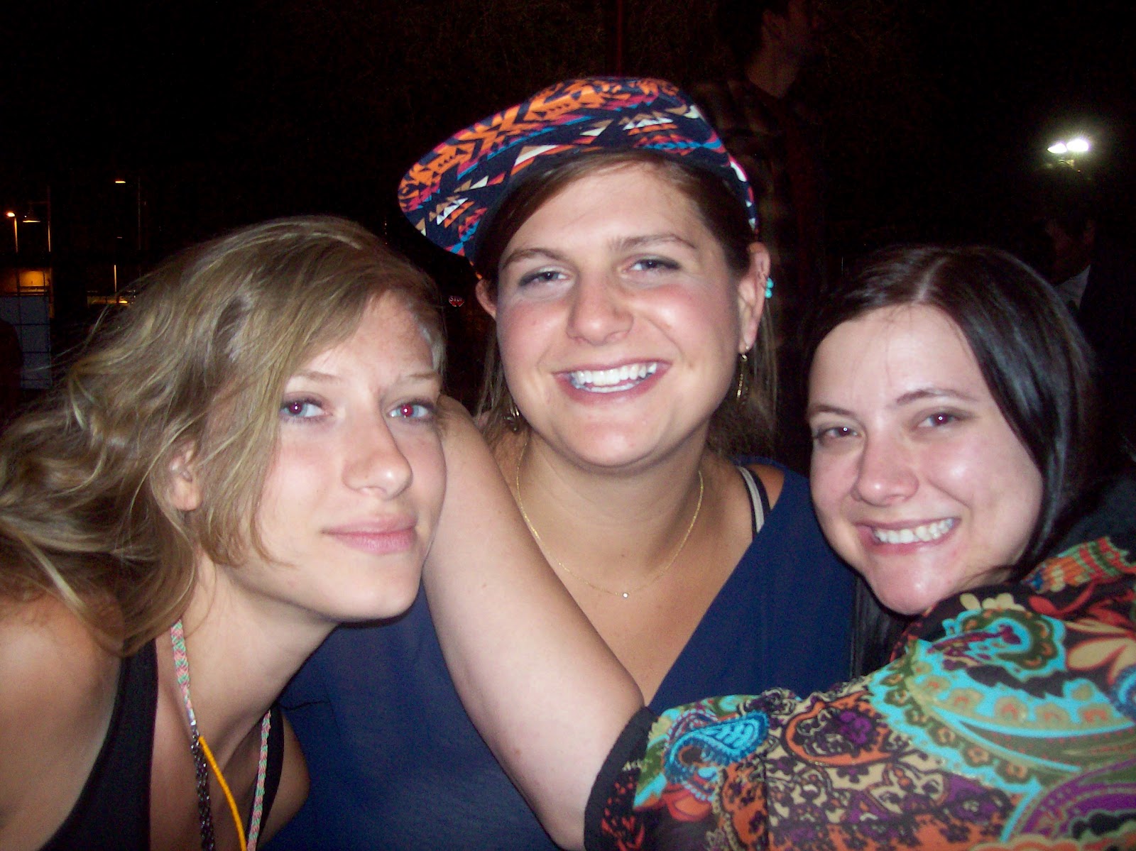 |
| Going to miss these ladies! Kim Michalak, Nina Dine and myself |
 | |||
| Certified! |
Subscribe to:
Posts (Atom)