Saturday, February 18, 2012

January and February at Tamarind- Collaborations 1 and 2

"Flying of the Bulls" by Jamie Kovach
I think I mentioned in my last post about the collaborative nature of this new semester at Tamarind. Our first three collaborations rotate on a two week basis, and our last three on a three week basis, which means in this limited time we meet with our artist, allow them time to create an image, and pull trial proofs for paper, colors, and layers until the artist is happy with the result. We limit the trial proofs to four just to stay on schedule, and because sometimes too many options just becomes confusing. Once an artist has a trial proof they like they sign is as the ATP or Approval to Print. The edition (the size is up to the artist, again, with a limit of 15 to stay on schedule) is then pulled and matched to this ATP.

So my first collaboration was with a graduate student at UNM named Jamie Kovach. Jamie mostly worked in photography and recently in painting in the style of paint-by-numbers, and while she had done some printmaking in the past, she hadn't done a lithograph. Because of this I thought it important to get her involved in the process more than just shooting a photo plate, so we transferred the image to ball grained plates, and split it up into three runs. One for the blue of the sky, one for the bulls, and then the key.

Elizabeth Sobel's print
Overall, I think for the first collaboration it went very well. Jamie was very easy-going and fun to work with, and I loved the sense of humor she had in her work. To the left is the finished print "The Flying of the Bulls." You know, like the running of the bulls. But more extreme. And with zeppelins.

To make life a little easier my classmate Richard and I have been working together, so I get to see and be a part of the collaborations he's working on as well. I won't go so much into detail, but I did want to post a picture of his artist's, Elizabeth Sobel, first print.  Elizabeth did a two run print, a tone plate in the background, with stop outs for the figures in front, and the key in black.


In between projects we still have a few demos from Rodney. Our first was on the huge Steinmesse & Stollberg (S&S) flatbed press. Rodney had us pulling flats one day, and mono-prints the next day. The whole experience was pretty cool. That press is gigantic, and a little intimidating, but very impressive. We've yet to fire it up and run it automatically, but Rodney tells us it's loud and awesome.
Richard inking up the plexiglass on the S&S
 
I missed the second day mono printing on the S&S, but luckily we had another day for mono printing on the regular Takach presses. The idea was the same- ink up a plexiglass and run it through the press.

Marvin added some Fresca, and Rodney pulled the print- clearly his finest work to date.
Back to collaborations! My second two week collaboration was with Marcos Polaco. Before we even began Marcos and I had talked about doing a maniere noir style print for the key, and I suggested Michael Barnes's method because it was easier to reduce and it was something new for Marcos to try since he had done quite a bit of litho in the past. We originally pulled three trial proofs with a blend for the sky and a blend in the supporting plate in the background, with the key on the stone. 


The first three trial proofs
After seeing the colors in the proofs Marcos decided the green was too vibrant, and didn't marry well with the areas in front where the paper showed through. A fourth trial proof was pulled with just the sky and the key, but upon seeing it and talking a little more we decided not to abandon the second plate all together and instead just create a color a bit darker than the paper to give it some definition, but not be so stark a difference that it took away focus from the key plate. This last trial proof then became the ATP. 
"Sleeping Giant" by Marcos Polaco
Marcos put a lot of time into the key, and the results were beautiful.

The image on the stone before etching and processing
Detail of some of the bushes in the foreground
Sponging away the gum to reveal the crackle effect


Friday, February 3, 2012

Semester 2 (Electric Boogaloo)

Sorry. I can't help but make a Breaking II Electric Boogaloo reference whenever possible.


A lot has happened since my last post. The year ended with a few more big projects, including an introduction to photo plates, converting those plates to waterless, and a big three color reductive stone. 

Before arriving at Tamarind I had never seen or used photo plates. We did a four color separation on the computer and printed out films for cyan, magenta, yellow and black, exposed those mylars to the photo plates and printed each plate individually. The real challenge came in perfectly registering each mylar, and printing a correct ink film- too lean and the image looks spotty; too heavy and the image feels weighed down.

Overall though, they turned out beautifully, and I felt comfortable enough using them that over the winter break I took a trip up to Fargo and did a workshop at MSUM for a few students who were still around.

However, what I really loved was the three stone reductive method. I've come to realize reductive work is one of my strengths, and I was eager to try Barnes's method again at a larger scale (nearly full sheet). For this process three primary color runs were printed and overlapped to create a variety of colors, including browns and black.


Yellow first, then red, then blue. I prepared a stone, reduced all the areas I wanted to keep white, and all the areas that didn't have yellow in them (purple, pure blue and pure red for example). I pulled the whole edition in yellow, then altered the stone, removing all the areas I wanted to keep yellow or that didn't have red in them (like green), and added areas that had red but not yellow and printed red over the yellow. The same was done with the blue. It may sound a little complicated, but with some planning on what needs to stay and what needs to go it was fairly straightforward, and the result was beautiful.


So this was the last project of the semester. Spring semester has been much different than the first. First semester focused on demos and techniques, and the second involves working with and printing collaboratively with graduate (and a few undergraduate) student artists from across the street at the University of New Mexico.

In December Rodney interviewed interested students, and seven were chosen to work with the seven of us printers. So for two to three weeks we're paired up with an artist and print an edition with them, up to four runs. Since this entry is getting a little long I think I'll save my next post for my first and second collaborations. Til then!

Sunday, November 20, 2011

Eggs, Darkrooms, Crayons and Craziness

This week has been one of those "Let's try every process under the sun" kind of weeks. Monday was egg albumen, Tuesday was negative diazo, Wednesday was Dolphin litho transfer paper, Thursday was crayon making, and Friday was caran d'ache. Friday was a short day and we took a trip to Rodney's house for dinner and a chance to relax.

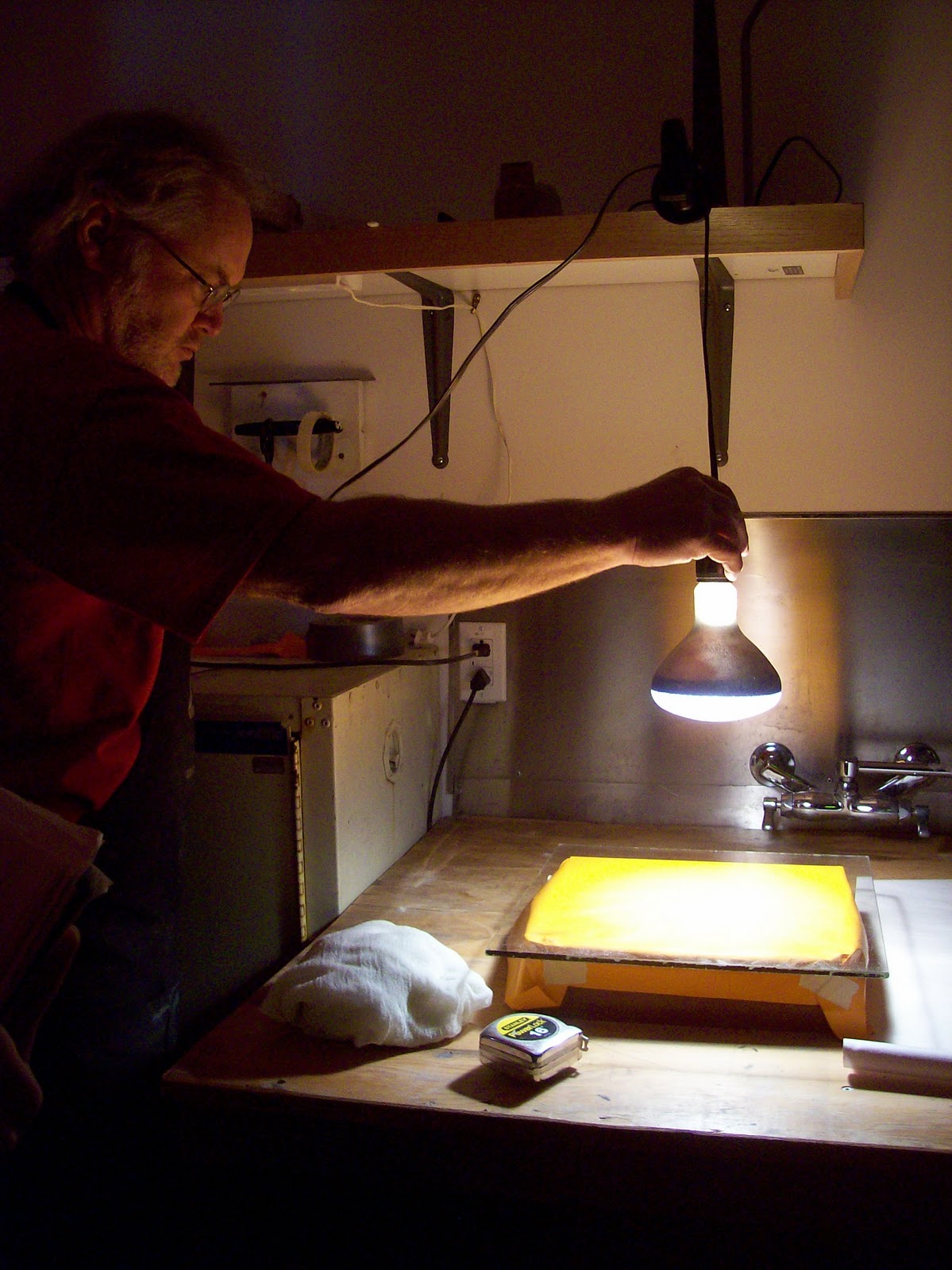
So... Monday! Both egg albumen and negative diazo are negative printing techniques where a negative is exposed over an emulsion base. The negative is then exposed to light and any area not covered become black. Egg albumen utilizes strained egg whites mixed with ammonium dichromate and coated on a stone as a base. Exposure can be done either out in the sunlight (for approximately 1 minute) or under a grow light (pictured) for anywhere from 10-15 minutes depending on the temperature, the thickness of the negative being exposed, the thickness of the egg coating, the strength of the bulb, etc. etc. Basically, there's a lot of variables to consider, and the failure rate is... above average.

My first attempt failed.  I had used two negatives and aligned them to make the toner thick enough and I think the tape at the sides made the negatives buckle, hence the dark/burned spots in the image. Luckily, the egg comes off easily, so back to the graining sink and time to try again. Luckily attempt number two was a success.

 Attempt 1= Boo.

Attempt 2= Hooray!

Negative diazo was similar in theory to egg albumen. Diazo coats a plate, a negative is exposed to light, and turns white areas black. The result was a nicer resolution than egg albumen, but sadly the materials are no longer available.

Rodney with the diazo on the plate (left) and the egg albumen on the stone (right).

My classmate Richard's diazo plate.

Wednesday brought with it Dolphin litho transfer paper. Transfer paper was originally used in the early days for en plein air drawings. An artist could easily transport a sheet of transfer paper, do a sketch on site, and return to the studio to transfer the image to a stone. Because there is a loss of detail from the transfer paper to the printing matrix (plate or stone) it often has to be reworked or added to. Transfer paper has a type of emulsion on the surface of the paper that, when dampened becomes tacky and releases, kind of like a temporary tattoo. The emulsion dries for a few minutes after transfer and then is gently wiped away, leaving only the drawing material. 


Rodney with his awesome transfer of Santa Claus and Mr. Potato Head riding a convertible in the forest. :) 

The start of my own drawing on transfer paper.

Everything was going smoothly until I decided to try a gum stop out over my crayon drawing to protect against solvent washes- I didn't want the washes to bleed into the crayon.  Unfortunately when I transferred the paper to my stone the gum lifted out all the crayon it had been protecting and left me with a big ol' splotchy mess. A little counteretching and subsequent crayon work and I had a useable image again.

The transfer on the stone after reworking.
Undoubtedly the highlight of demo week was crayon making. Fumes, chemicals and fire filled the air as we melted together ingredients to make our own crayons. A local artist also lent us his crayon molds, so the final product looked incredibly legitimate too. 

Rodney mixing together the ingredients. 
Richard brought in a bag of old crayons to melt down as well.
Pouring the concoction into the molds.

Finally Friday and a demo on caran d'ache. Caran d'ache is a method where a water soluble substance is drawn onto a plate or stone, asphaltum is buffed in, and water lifts up the drawing material, leaving wherever you've drawn white, while the rest rolls up black. However, the demo didn't go according to plan. Early in the semester I had a strange plate that developed "frog skin" for no apparent reason. That is, the plate speckled, and speckled bad. I ran my edition and pawned off the rest of the unused plate on Rodney so he could use it for demos. 

He used it for this demo. 

It didn't work.  

We all had what Rodney referred to as "Leavingitis" and decided it was a bad idea to do a demo when we were heading to his house so soon, instead we abandoned caran d'ache for spaghetti and meatballs.

Sunday, November 13, 2011

Tamarind

Why, hello again. For the last few months I've been trying to decide how and when to get back into updating this blog. Today, I feel, things have come full circle since my last post and it's time to brush off the cobwebs and start again.

A lot has happened over the last few months, almost all of it for the good. I finished my applications to graduate schools, got accepted to a few, and made my decision when I received my acceptance letter to the Tamarind Institute in Albuquerque, NM to participate in their printer training program (PTP).

For the past 50 years Tamarind has been at the forefront in reviving the art of lithography in the United States. Prior to Tamarind, lithographs produced in the states were basic, black and white lithographs created by a select few printers. Artists hoping to make anything of real quality, or involving color needed to travel to Europe. Founder June Wayne realized the need for a program like Tamarind that would train master printers to work in the US, and to restore the prestige of the medium. With funding help from the Ford Foundation June founded Tamarind Lithography Workshop in Los Angeles, and 10 years later affiliated with the University of New Mexico where it became the Tamarind Institute. This is the bare basics of the history of Tamarind, their website has a bit more on the subject and a link to a fantastic article by Clinton Adams where he writes about the early years of Tamarind.

Today Tamarind invites eight students a year from around the world to participate in the PTP. These eight students go through the year long program, with the first semester dedicated to improving technical skills, and the second semester dedicated to working collaboratively with graduate students from the University of New Mexico. After the year long program one or two students of the original eight are selected to participate in the Master Training Program for another year, after which they are certified as Master Printers. Many of the lithography workshops around the USA, and several around the world are operated by Tamarind Master Printers.


To be part of such an amazing and prestigious program still leaves me speechless.


For the past 12 weeks I have lived lithography. The days are long, have their ups and downs, successes and failures, but when all is said and done there's nothing else I'd rather be doing. The first few weeks were spent doing technical tests: crayon drawings on stone and plate, tusche washes (both with water and solvent) on stone and plate, counter-etching, flats, toner, etc. etc. To go into detail on all of these would- 1. Take forever and 2. Be redundant, as my classmate Richard has already done a fantastic job, and I'll just link you to his blog- the aptly named School of Flat Rocks. :)

Around week 7 things got really interesting. The technical tests behind us, we began working on putting them to use, and working collaboratively with other PTP students, first in black and white, and then in color. We then moved to large format prints, and Rodney (my instructor, and the education director) taught us the professional way to do a blend roll. A -huge- blend roll at that. Next came some less traditional techniques including maniere noir, acid tinting and chine colle. I was especially excited about maniere noir because it allowed me to try another stone using Michael Barnes's method of asphaltum reduction, which none of my fellow students had seen before.


For this stone I wanted to try a few of the techniques Barnes had mentioned, but I hadn't attempted before, such as painting in asphaltum additively, and leaving gum on the stone to produce a "crackle" effect, which I used for the background. 

Even though I would be printing this in black, I still found it much easier to scratch through the asphaltum base versus black ink (which tended to clog up) or a tint field (which proved difficult to etch without burning). Printing this stone went infinitely better than the last time. Some of the extremely delicate marks filled in, but overall printing was a breeze and I was extremely happy with the results.

The prints laid out (the last print pulled on the left, the standard on which all the prints pulled are compared in the center, and the first trial proof on the right).


Wednesday, December 8, 2010

Asphaltum Lithography Print

After the MAPC conference and Michael Barnes's demonstration on asphaltum reduction lithography I was itching to try it out. As soon as I had all the materials and a base rolled out on the stone I began work on an image. It took a little longer than I expected, mostly because it acted like a mezzotint, in that I thought I had a clean, white area only to go back to it the next day and have to "brighten" it back up. Not to mention all those damn little curls.

The (upside down!) stone on the press.

Since the asphaltum was fairly reflective it was difficult to photograph, hence the wonky perspective. I was a little nervous to print it, simply because I really didn't think the image was going to look as good as it did on the stone- I wish I could have just framed the stone and called it good!

Long story short, I had quite a bit of difficulty printing. The image filled in a bit, and my attempts to "fix" things just made it much, much worse. Oops. I finally converted it back to a traditional base and managed to pull an edition, but it was a struggle to say the least.

And the print!
 
It was a great learning experience, however, and I've already got a second image underway to accompany this one. :)

Saturday, November 27, 2010

The Mid America Print Conference and a week with Carol Wax

 
As I alluded to in my last post, a few weeks ago a friend and I drove down to the Twin Cities to attend the three day Mid America Print Conference, put on by the Mid America Print Council. This is a semi-annual event held every two years at various locations throughout the Mid West. The previous time I went was my first experience, and it was right in my backyard of Fargo. I had a blast, and couldn't wait to experience it again. On the agenda were lectures, gallery tours and openings, demonstrations, vendor's fairs, and a multitude of other print-related activities.

One of the earlier demonstrations I attended was entitled "Extreme Chine Colle" and was put on by the Highpoint Center for Printmaking, a beautiful printmaking studio located in Minneapolis. Here is Cole Rogers, Artistic Director and Master Printer at Highpoint, along with his assistant Zac Adams-Bliss attaching four large pieces of chine colle one on top of the other before placing it on a plain sheet of paper for backing support. The overlay of the chine colle pieces gave a beautiful depth and subtle variation of grays.

While I enjoyed the chine colle demo it wasn't something I could see using regularly in my work.

What really got my attention was a reductive asphaltum lithography demonstration by Michael Barnes. Similar to the "maniere noire" or "black method" used in traditional stone lithography the stone is worked reductively to create the image, either by scratching into the stone, using an abrasive, or a solvent.


The main difference is in the base, which is asphaltum thinned down with mineral spirits instead of a traditional rolled up ink base. What was extremely impressive about this method was the ease of reducing the image and printing various colors. During the relatively short demo, Mr. Barnes processed, reduced, and printed three colors in about the span of half an hour. Also impressive were the extremely soft and subtle effects he achieved.

Below is a stone he had been working on- you can see the delicacy of the marks. The faint lines over the top are just from the sponge.


In addition to the demos were various panels, like this one featuring Jack Damer (lithography teacher at Madison) and Beauvais Lyons (lithography teacher at Tennessee-Knoxville). This current discussion was about a survey conducted by Beauvais sent out to members of the MAPC, and generally covered trends in printmaking, generational differences, and teaching. 

One of the last nights of the conference we took a bus tour to various galleries around the cities. About halfway through the tour we stumbled upon an opening reception featuring the work of Lloyd Menard- the originator of Frogman's Press in South Dakota. Mr. Menard was also honored with the Outstanding Printmaker award this year from the MAPC. It was a real treat to hear him talk about his process, ideas, and changing aesthetics over the years, as well as view a huge collection of his prints spanning over the last few decades. 
Overall the conference was an invaluable experience, and I can hardly wait for the next one. Hopefully I'll be able to attend Southern Graphics next year, which I'm told is like this conference on steroids. Sounds like fun.


____________________________________________

So, as if the conference wasn't exciting enough, two days after returning home I had the honor of meeting and spending time with the one and only Carol Wax. That's right- the woman who literally wrote the book on mezzotint art. She was giving a three day workshop in conjunction with a symposium lecture series put on by Minnesota State University Moorhead art department. Unfortunately I don't have any images to share since she didn't care much for having her picture taken, but over those three days she talked about the history of the medium, lectured on her own work, and gave hands on demonstrations for preparing the plate and how to print it. Like the conference, it was a lot of information to take in in a few short days, but Carol seemed so excited and eager to share her knowledge that it was hard to not be excited. Plus she was just such an interesting and kind person- I feel very lucky to just have met her. :) 

Wednesday, October 27, 2010

Franconia Sculpture Park

As I continue work on a post about the Mid-America Print Conference I figure I'll do a quick entry on the Franconia Sculpture Garden first. This little park is located in Franconia, MN just along the border of Wisconsin. It's free and open to the public and regularly has events scheduled to get children and adults interested and involved in the arts, along with providing a work and exhibition space for established and emerging artists.

I hadn't been there in years, and only visited it again a few weeks ago, but always remembered it being pretty cool. So, my friend Erin and I went to visit it, and just before the conference my friend Shaina and I went again. I forgot my camera the first visit, so all of the images are from the second time around. :)

Below are just a few of the sculptures at the park. Sadly I forgot to get the names of the pieces or the artists (oops) so I'll let the art speak for itself. Click on any of the images for a larger view.


I really liked this piece. At the end of each wire was a plate, and on those plates were every word in the English language in extremely fine print. 
The following two pieces were my favorite in the park. The first really isn't much to look like from the outside, consisting of black wood with a small entrance.


 However, when you go inside and turn the corner...


:) The planks inside are probably about two to three feet deep, so you need to walk back and forth to get any idea of what's on the outside. Also being placed outside, the transition from bright sunlight to darkness had a very eerie effect.

My other favorite piece was this suspended, floating shed. 


and not just because there were duckies. :)