Wednesday, December 8, 2010

Asphaltum Lithography Print

After the MAPC conference and Michael Barnes's demonstration on asphaltum reduction lithography I was itching to try it out. As soon as I had all the materials and a base rolled out on the stone I began work on an image. It took a little longer than I expected, mostly because it acted like a mezzotint, in that I thought I had a clean, white area only to go back to it the next day and have to "brighten" it back up. Not to mention all those damn little curls.

The (upside down!) stone on the press.

Since the asphaltum was fairly reflective it was difficult to photograph, hence the wonky perspective. I was a little nervous to print it, simply because I really didn't think the image was going to look as good as it did on the stone- I wish I could have just framed the stone and called it good!

Long story short, I had quite a bit of difficulty printing. The image filled in a bit, and my attempts to "fix" things just made it much, much worse. Oops. I finally converted it back to a traditional base and managed to pull an edition, but it was a struggle to say the least.

And the print!
 
It was a great learning experience, however, and I've already got a second image underway to accompany this one. :)

Saturday, November 27, 2010

The Mid America Print Conference and a week with Carol Wax

 
As I alluded to in my last post, a few weeks ago a friend and I drove down to the Twin Cities to attend the three day Mid America Print Conference, put on by the Mid America Print Council. This is a semi-annual event held every two years at various locations throughout the Mid West. The previous time I went was my first experience, and it was right in my backyard of Fargo. I had a blast, and couldn't wait to experience it again. On the agenda were lectures, gallery tours and openings, demonstrations, vendor's fairs, and a multitude of other print-related activities.

One of the earlier demonstrations I attended was entitled "Extreme Chine Colle" and was put on by the Highpoint Center for Printmaking, a beautiful printmaking studio located in Minneapolis. Here is Cole Rogers, Artistic Director and Master Printer at Highpoint, along with his assistant Zac Adams-Bliss attaching four large pieces of chine colle one on top of the other before placing it on a plain sheet of paper for backing support. The overlay of the chine colle pieces gave a beautiful depth and subtle variation of grays.

While I enjoyed the chine colle demo it wasn't something I could see using regularly in my work.

What really got my attention was a reductive asphaltum lithography demonstration by Michael Barnes. Similar to the "maniere noire" or "black method" used in traditional stone lithography the stone is worked reductively to create the image, either by scratching into the stone, using an abrasive, or a solvent.


The main difference is in the base, which is asphaltum thinned down with mineral spirits instead of a traditional rolled up ink base. What was extremely impressive about this method was the ease of reducing the image and printing various colors. During the relatively short demo, Mr. Barnes processed, reduced, and printed three colors in about the span of half an hour. Also impressive were the extremely soft and subtle effects he achieved.

Below is a stone he had been working on- you can see the delicacy of the marks. The faint lines over the top are just from the sponge.


In addition to the demos were various panels, like this one featuring Jack Damer (lithography teacher at Madison) and Beauvais Lyons (lithography teacher at Tennessee-Knoxville). This current discussion was about a survey conducted by Beauvais sent out to members of the MAPC, and generally covered trends in printmaking, generational differences, and teaching. 

One of the last nights of the conference we took a bus tour to various galleries around the cities. About halfway through the tour we stumbled upon an opening reception featuring the work of Lloyd Menard- the originator of Frogman's Press in South Dakota. Mr. Menard was also honored with the Outstanding Printmaker award this year from the MAPC. It was a real treat to hear him talk about his process, ideas, and changing aesthetics over the years, as well as view a huge collection of his prints spanning over the last few decades. 
Overall the conference was an invaluable experience, and I can hardly wait for the next one. Hopefully I'll be able to attend Southern Graphics next year, which I'm told is like this conference on steroids. Sounds like fun.


____________________________________________

So, as if the conference wasn't exciting enough, two days after returning home I had the honor of meeting and spending time with the one and only Carol Wax. That's right- the woman who literally wrote the book on mezzotint art. She was giving a three day workshop in conjunction with a symposium lecture series put on by Minnesota State University Moorhead art department. Unfortunately I don't have any images to share since she didn't care much for having her picture taken, but over those three days she talked about the history of the medium, lectured on her own work, and gave hands on demonstrations for preparing the plate and how to print it. Like the conference, it was a lot of information to take in in a few short days, but Carol seemed so excited and eager to share her knowledge that it was hard to not be excited. Plus she was just such an interesting and kind person- I feel very lucky to just have met her. :) 

Wednesday, October 27, 2010

Franconia Sculpture Park

As I continue work on a post about the Mid-America Print Conference I figure I'll do a quick entry on the Franconia Sculpture Garden first. This little park is located in Franconia, MN just along the border of Wisconsin. It's free and open to the public and regularly has events scheduled to get children and adults interested and involved in the arts, along with providing a work and exhibition space for established and emerging artists.

I hadn't been there in years, and only visited it again a few weeks ago, but always remembered it being pretty cool. So, my friend Erin and I went to visit it, and just before the conference my friend Shaina and I went again. I forgot my camera the first visit, so all of the images are from the second time around. :)

Below are just a few of the sculptures at the park. Sadly I forgot to get the names of the pieces or the artists (oops) so I'll let the art speak for itself. Click on any of the images for a larger view.


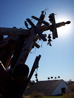
I really liked this piece. At the end of each wire was a plate, and on those plates were every word in the English language in extremely fine print. 
The following two pieces were my favorite in the park. The first really isn't much to look like from the outside, consisting of black wood with a small entrance.


 However, when you go inside and turn the corner...


:) The planks inside are probably about two to three feet deep, so you need to walk back and forth to get any idea of what's on the outside. Also being placed outside, the transition from bright sunlight to darkness had a very eerie effect.

My other favorite piece was this suspended, floating shed. 


and not just because there were duckies. :) 

Thursday, August 26, 2010

The Show and The Aftermath

 
In the last three and a half months I have: 1. Shown my work in my final BFA show; 2. Graduated college; 3. Moved into a new apartment; and 4. Gotten a full-time job (not in my field, but it's just temporary until grad school, so I'm okay with that). Needless to say, things are changing, and that's both exciting and a little scary. The next few months promise to be nearly as hectic, with the Mid-America Print Conference happening in Minneapolis the end of October, applications for grad schools coming up, and having to make artwork to -put- in those applications.

Going back a few months though, I have a few pictures from the show to share. The overall theme of the show was the explore the dichotomy of children- maturity and innocence, cruelty and love- cruelty either conducted by children or inflicted upon them. Many of the pieces were inspired by stories from others' childhood experiences, or drawn from my own.

The gallery manager pretty much allowed us complete freedom when it came to the set-up of the show. I had requested three separate walls because I had three different collections of work- my linocut series, my lithographs, and my 3-D wheel piece. Luckily they were able to accommodate my needs, which was great since cohesion was the main concern that kept coming up in my critiques.

On the left wall was my series of three lithographs of the two boys with the cats. The back wall had my four multi-color linocuts, and the right wall had two other lithographs, and a small wall to bring forward the 3-D wheel.


The whole thing went beautifully, and tons of people came out to support us all, which was great. My family drove up from the twin cities to see it, and my other brother surprised me by flying out from L.A. which was amazing. Needless to say seeing him was a joy, and I got so excited by everyone showing up that I forgot to take pictures... Oops. So the only photos I have of the whole thing are during set-up, which is why it's a little dark, and a little empty. :)

I realize I haven't talked a lot about my non-linocut works, which is funny since I really think lithography is my go-to medium of choice. Not to mention that it's half of what this blog was supposed to be about (Blocks and STONES). Oh well. There's still time. :) Anyway, further posts will go into more detail about my lithographs, but basically I print on a semi-transparent vellum and combine it with drawings underneath. What I love about working like this is the starkness of the black on the vellum versus the softness of the drawings underneath, especially when using something like chalk pastel which already gives such a rich softness.


Monday, May 3, 2010

A Long Overdue Update- Linocut IV and Show Invites

 
Yeah, have I mentioned I'm still new to this blog thing? Sometimes it seems that things get too busy and then this blog just gets pushed to the back burner. However, as I sit here writing the last paper I will have to write as an undergraduate, I imagine summer, and a life "less hectic and gross" as a friend of mine so eloquently put it, and envision a time to fritter away in between work and art. It's close.

But I'm here now, so let's get on with it, shall we? :)

I mentioned in my last post that I had found a positively, absolutely, far too scary for pictures doll at the thrift store I frequent. I still refuse to touch the thing, and even as I type this it is sitting in the corner of my studio space tightly encased in a plastic bag. The problem I had with the thing (besides touching it, ew) was not with the doll itself, but my linoleum. For the last three I had been using 9x12 tan Speedball linoleum, mounted on a block. I had purchased some linoleum online, but realized after I bought it that it was unmounted. Turns out it was a touch too small as well. So I had to wait about a week and a half for new linoleum to come in. This, naturally, sent me into panic mode as I planned for this one to have around 30 colors or more like the first two, and I needed to have it done before my show.

When my linoleum finally arrived I went into overdrive, printing two colors at once, sometimes twice a day if the cobalt would let me. Long story short, I had about a month and a half to get the thing done, and it took all of two and a half weeks. And had 35 colors. Yikes.

Without further ado...

So I had another few weeks to finish up my other projects and build frames, which was nice. Also during that time I created some invites for my show (which is up at the moment, but I'll save that for another post in the -near- future). I think my favorite was this one...

Check back soon for a post about the show!

Monday, March 8, 2010

All My Ducks in a Row

 
Literally.
The duck linocut is complete! Sorry for the lack of in-progress posts, but this past month has been very busy, and the next two months don't look to be any easier, with the BFA show fast approaching. In all likelihood our town is probably going to flood (again) and close down school (again) and we'll all go sandbagging (again) because somebody didn't invest in proper dikes (again) and the entire show will be postponed til summer... but better safe than sorry.
Aside from the chickenpox this whole print went pretty quickly with no major glitches. Last I counted it was around 21 colors, which is just over half what the other two were, but I think stylistically it still fits in with the other two.

I've decided to do one more image in this series before saying goodbye to it. I'm not entirely sure of my next image, but I picked up an old doll today at this amazing thrift store next to the Plains Art Museum where I intern, and I'm going to get some photos of it today. Hopefully it goes well and I can start as soon as my linoleum comes in.

Wednesday, February 10, 2010

My print has Chickenpox...

 
So I had a very... interesting* last few days.
I came up with my new image for my next linocut in the series and the first few colors went down without a hitch. My third color I started noticing little shiny spots that appeared that I couldn't explain. Attributing it to not mixing in my modifiers well enough I pressed on. With disastrous results.


The next color I noticed large shiny spots appearing after a few minutes. Puzzled as anything, I took it to my professor who was equally as perplexed. I printed it as I have been for months- adding cobalt drier, dullit, magnesium carbonate, and a little gelled medium (we're out of miracle gel reducer. Weep). I mulled over the problem for a day or so, trying to figure out what had gone so horribly wrong. My initial idea was there was a problem with the dullit, since only spots were shiny, and others dull. I had also mixed in some of the old ink from the previous color as a base and maybe the modifiers that were in -that- screwed it up. I was confused until I took a close look at the full edition.

I remembered my first print on newsprint I had forgotten to add cobalt drier, and printed the rest of the edition with it. Out of the 17 prints on good paper, and 3 on newsprint there was one lone newsprint pull that looked just fine. I realized my problem... What exactly went wrong with the cobalt drier I can really only guess at, but the can we have at the studio has a lid that doesn't shut all the way, so my guess is whatever liquid is in there as a base has been slowly evaporating, making the drier more and more concentrated, so adding a good deal of drier like I normally would was actually like adding quadruple the amount, because I also noticed that as the spots appeared they, along with the rest of the print, was already dry after only 10-20 minutes.

Anyway, lesson learned. I printed the yellow of the duck next, added some linseed oil to sit over the spotty brown, and left out the drier completely. It seemed to work alright, and now I just hope the rest of the colors behave themselves.

Has something like this happened to anyone else?


*Note: I'm a Midwestern girl, and "interesting" is often our way of saying "awful." As in "Wow. That bologna and popcorn casserole you made sure is.... interesting."

Friday, February 5, 2010

Reduction Multi-Color Linocut Tips and Tricks

 
This post compiles several months worth of learning while doing multiple color linocuts.
These are the things I've screwed up and learned from.

Before I begin I'll start with a few points on how I work-

1. I work very opaquely. I can try and answer questions about transparency, but they'd be just educated guesses, not tips from real life experience.

2. I only print with oil based litho color inks. This means modifiers are in order. Modifiers and I have become close friends.


THE BASICS


  • Print with a hard or semi-hard roller. Soft rollers tend to fill in delicate lines. In reduction linocuts you want the ink to sit on top of the block and hard rollers do the trick nicely.
  • Rolling quickly picks up ink. Rolling slowly deposits it. On your ink slab you want to roll fast to lift the ink, and on the block you want to roll slow to lay it down. 
  • It's sometimes helpful to mix ink the day before you print just to get a feel for its consistency. Mixing an ink loosens it a great deal, and by the time you're ready to print you may find it's hardened or changed quite a bit. 
  • Add modifiers just before you print. Modifiers and time generally don't mix well. Especially cobalt drier...It's fine to mix up your color earlier, but save the additives for later. 
  • When mixing ink and testing the consistency, test with a small 1/2 inch or 1 inch roller. This way you'll be able to see how the ink rolls out without having a big mess to clean up, and you can save your larger roller for good prints. 
  • Blocks can be cleaned with just mineral spirits or vegetable oil and a clean rag. Remember to degrease the block before you print again though, either with denatured alcohol or a household cleaner like Simple Green, especially if using vegetable oil, which tends to be very greasy.
  • Give yourself plenty of time! The one time you find you need to print an edition in an hour is the one time -everything- will go wrong.

THE INTERMEDIATE

  • Printing on a paper with texture is, in most cases, not the best idea. In fact, I generally stretch my paper on a litho press before I begin (placing the paper on a large block and running it through the litho press, which stretches and smooths the paper). This way if there's a great deal of pressure when printing the block the paper doesn't stretch in the process and cause the registration to be off. Stretching ensures for spot-on registration.
  • When cutting and registering paper include about 3-4 newsprint pieces that are also registered. This way before printing the edition on good paper, the newsprint paper can act as a test to see how the colors interact with one another, and how the ink sits on top of the previous layer. This way too, there isn't risk of ruining a good pull from the edition.

THE ADVANCED

  • To ensure a nice even coat, roll slowly over the block until it looks as though there is a great deal of ink on the block. Roll out the excess ink on the roller on a clean part of your slab and roll quickly a few times over the block (from different directions) to lift off a little of the excess and unify the coat. Modifiers will come into play with this too, see below (Miracle Gel Reducer in particular) for more...
  • FAT OVER LEAN....or...GREASY OVER NOT SO GREASY...or...INK WITH STUFF IN IT ON TOP OF INK WITHOUT AS MUCH STUFF IN IT. This is the, the, -the- main thing to know when printing a multi-color linocut. If you find your ink is not sitting over your last layer of ink this is probably the problem. You never want to start out with a really greasy first layer because subsequent layers are going to need even more grease to sit on top. When beginning a reduction linocut I generally don't modify the ink very much- a little magnesium carbonate and cobalt drier are enough. The next layer I'll add a little bit of grease, and a little more to the next, and so on and so forth, but this will be covered more in the modifiers. If you find your ink isn't sitting on top of your previous layer try adding a little grease to it (such as linseed oil).

THE MODIFIERS (not all of them, but the most important for this process)

  • Linseed Oil- The main component in oil based ink. Ink is generally just linseed oil and pigment (with a few little things added in). That's it. If you want to loosen up an ink, add some more linseed oil. Add in small doses.
  • Magnesium Carbonate- A white powdery substance that can be added up to 100%. Doesn't alter the color of the ink. Stiffens (or "shortens") ink, adds body, and decreases greasiness. Reduces tack.
  • Setswell- Loosens oil based ink, creates transparency and reduces shine. Thins and softens ink that are too stiff and seem "dry" when printed.
  • Cobalt Drier- The best friend of anyone who needs to print a color a day. Although it's recommended to only add a tiny drop of this powerful drying agent, you can sometimes get away with adding more. I've been known to add a great deal (20-30% in a bind) BUT you need to be ready to print -FAST- because the ink will literally dry on the slab. If adding a great deal only roll out enough ink to cover your roller. In a pile, the ink seems to dry slower, so just take it as you need it. Also, if you add cobalt drier and keep the ink to print again later it -will- work, it just needs to be used within a day or two, and generally loosened up a bit because it will probably have begun to harden somewhat. 
  • Dullit- Print too shiny? Hate shiny? Want to murder shiny as it blinds you in the face as you try to photograph your print after it's finished? It's all just personal preference of course, but personally I'm not a fan of shiny prints, give me matte any day. So the solution? Why, Dullit! Add about 10-15% to ink to decrease shininess. Just make sure not to add too much or it'll mix up like concrete. 
  • Miracle Gel Reducer- I've saved the best for last. This little gem is basically the answer to everything. I'm voting for MGR next presidential campaign... Almost any relief printing problem can be cured with a small dose of miracle gel reducer. It reduces body and tack of oil based inks, without increasing greasiness. It makes relief inks release onto paper easier and reduces roller and lap marks on large flat areas of color. Its ability to cure cancer has not yet been proven, but I'm pretty sure it could probably do that too. Side note- there is a counterpart to MGR called "Gelled Medium" but for me it...just isn't the same.
  • Miracle Gel Reducer and Magnesium Carbonate- The dream team. The right amount of the two of these almost always ensures for near perfect consistency. Generally I add magnesium carbonate to give a little more body to the ink (the amount depending on the consistency of the ink to begin with- stiff inks get just a dash, and loose inks get quite a bit), then a bit of miracle gel reducer to decrease the tack. When mixing the ink I generally look to see if the palette knife picks up all the ink on the slab, without leaving a residue. With any of these modifiers it's going to take some practice to know what the "right" consistency looks and feels like, but starting with these two little gems is probably a good place to learn. 
Both the school and the museum I work at order most of its modifiers from either Daniel Smith or Graphic Chemical. In fact, everything except the MGR can be found at Graphic Chemical. They're particular amazing for their discussion board. Because it's a small company they are -extremely- helpful and personable. -ANY- question you have about -ANY- of their products is generally answered within a day or two, usually by the owner of the company. Overall just an amazing company.


THE MISCELLANEOUS

  • Rainbow Roll (or Gradients)- Rainbow rolls are a way of putting multiple colors down in a single pass. Lighter or darker variants of a single color can also be used to make a gradient. The ink it mixed up and put down on the slab one right next to another so that all the colors form a single (or near single, little gaps are okay) line of ink. The roller is then passed over this line of ink, and mixes on the roller. For example, if white is laid down next to a dark blue, the roller passes over the two and a line forms between the two of a new color- a light blue. The roller then passes over the block to create a gradient when printed.

If the task of printing look overwhelming, just remember- you've only got three things that can really be screwed up: the paper, the press, or the ink. It's got to be one of the three, so don't get discouraged!

Thanks for reading this far! I hope some of these were helpful and not a complete waste of time. If you have any other questions about the process or problems with printing feel free to comment and I'll try and help if I can. Check back soon for progress on my next multi-color linocut.

Galleries, Lectures, and Internships. Oh my!

These last few weeks have been crazy!
I mentioned a few post back that I had some exciting news to share, and here it is!

Every semester the Hannaher Studio at the Plains Art Museum (one of, if not THE sole working print studio inside a museum) chooses an intern to work with the resident printmaker to help maintain the studio, order supplies, talk to visitors, and make sure the place doesn't burn down. You know, the usual. The position is competitive, and applicants submit a letter of intent and a collection of their images that then get judged by the resident printmaker, (my professor, John Volk) the head of education at the Plains (Andy Maus) and a third party member. I think you probably know where this is going.... they chose me! So a few days out of the week I head over to the Plains and work in the studio, interacting with the public should they wander in, and explaining the mystery that is printmaking. It's pretty exciting, and a lot of fun so far. Problem is it usually closes around 5, and I'm a terrible night owl, so that's taking some adjusting.

The other exciting news is this past week I helped install a show in the library at my college and gave a lecture with the other Excellence Scholarship recipients. Our lecture focused on the progression of our work over the years, and the concepts behind it. Usually these colloquium lectures are full of Freshman students, but there was a great mix of faculty, Freshman, and friends. All in all probably around 100 to 150 people showed up, and the whole thing went over as smoothly as we could have asked for. It was a bit nerve wracking, but a great learning experience overall.

I haven't forgotten about my last post either, regarding linocut tricks. I'm compiling ideas as I start my third in the series (printed the first color tonight- yay!) BUT I want to hear from you linocut artists out there! What are some problems you run into when you print? What makes you want to stab your paper and throw your can of ink across the studio? Let me know and it might help me compile a more complete list. :)

Monday, January 18, 2010

Linocut Completion! (part IV)

Not a big post, but an important one... the dog linocut is done! Done! Finally! The last color was printed yesterday and thanks to about 30% cobalt drier it was torn down and editioned today. I ended up with an edition of 15, with 2 proofs on good paper, and 4 proofs on newsprint, which I mostly used for color and consistency testing to make sure the color not only looked good with the others, but sat atop the mountain of inks beneath it. Overall I'm extremely happy with the result, and especially with how it looks next to the phone linocut. They're a happy little pair. The crazy thing is, after tearing down my proofs of each color I went back and counted how many this one had and found the craziest thing... 36. Again. The phone had 36 as well. This wasn't planned in the least, and I was under the impression it was going to only be around 25 or so. Oops. Oh well, maybe the next one I'll shoot for 25 or fewer.

Without further ado...


If there's any interest in it as well... I was thinking of perhaps doing a post on tips and tricks I've learned while printing these guys. Namely, ink problems that arise, paper consistency, things of this nature, but I was also wondering if anyone is interested in the real basics of linocut printing? What is a linocut, how to print multiple colors, ways to register the paper, etc. So let me know if you'd like to see something of this nature and I'll share what little bits of knowledge I've learned. :) 

Tuesday, January 12, 2010

Linocut Update (part III)

Hello everyone!
Sorry for such a long stretch of silence, but it's the holiday season- I'm sure you understand. :) I know in my last post I mentioned this post would be about my sculptural piece but... it's not. Instead, I realized I was out of paper (Fabriano Rosapina- yum) to print my little wolves for the sculpture piece so I had to order some and that was on back order, so I decided to keep chugging away at my linocut. And I must say, it's extremely exciting to have the finish line so close now! With the new semester just starting it'll be nice to finish this project finally and move on to new and exciting things (which may or may not include another linocut). Over the Christmas break I took a week to drive home and spend some time with my family, eat far too many cookies, and sit around for far too many hours, but that was finished soon enough and my return to Fargo brought with it a new drive to create some art. I devoted at least a few hours a day to printing a color or two (or four) with each pass and soon realized I only had a few more before it was complete. So yesterday I printed a light blue, and today just finished the darkest of the blues. All it still needs is a few colors in the pull-string and this little puppy is ready to be editioned, signed and framed. Which is great because he'll be joining his little telephone friend in a small exhibit on campus. Check back soon for the finished, finished product, some exciting news, and (eventually, I promise!) a post about the sculpture. Happy New Year!