Friday, March 30, 2012

Collaboration 4 and Breaking Bad

Working on the limestone
So apparently there's this thing called "March Madness".  Word on the street it has something to do with "sports". Both of these things are fairly foreign to me, but I like the sound of "March Madness" and for me and my next collaborating artist it was "March Mastic Madness". That's right folks. Barnes's mastic resin asphaltum reduction once again! Not just once-but twice!

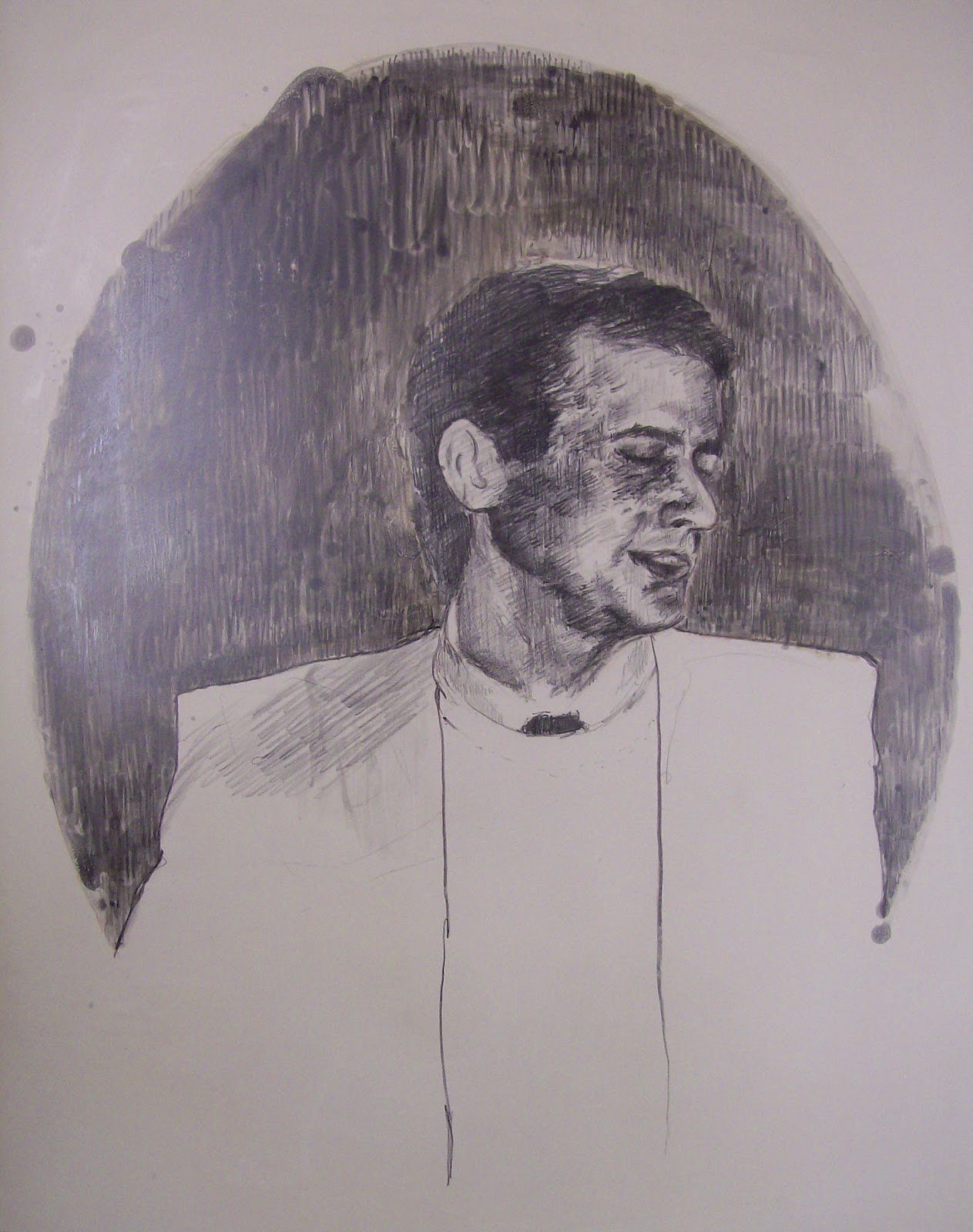
My next collaborating artist was Elizabeth Sobel, an undergraduate student from UNM with an amazing drawing style. For her previous projects Elizabeth built up her image to create rich blacks and subtle grays, and based on her past images I thought working reductively to pull out her brights and highlights would be faster than building them up. This was also the first time we had three weeks to complete a project instead of the two we had before. I knew that most of the time allotted for the project would go toward creating the image itself because of the detail and the size- a full sheet 22" x 30".


So, while Elizabeth was working on her image I started a small project of my own using the same method. This way I'd have something to work on, wouldn't make Elizabeth feel rushed, and would get to try out a few new things with the process that she could potentially use in her own image- including painting back in with the asphaltum mixture, and mixing it with mineral spirits. The end result was a three-run print with two plates in the background- a light green and a white on cream paper with the key printed in dark brown.


The completed image on the stone
All things considered, Elizabeth's image turned out infinitely better than my own. :) Here's her image on the stone before processing and rolling up in black. She was a little concerned about the image being too bright, but I assured her the change from brown to black, combined with the slight filling in of really light areas made with steel wool would result in a much richer, darker final image.

We trial proofed three different colors for the background- a light tan the color of the limestone, a darker tan the color of the limestone when wet, and a murky green. The lightest tan was on a different kind of paper that had too much of a texture, but the dark tan and the green looked beautiful.

Trial proof with tan background
Trial proof with green background

Personally I liked both and could see the edition going either way. Ultimately Elizabeth decided she liked the warmth of the tan better, and the edition was pulled with her approval.

In other news a gentleman came by Tamarind to give us notice they would be filming AMC's "Breaking Bad" next door at the Denny's last week. As you can imagine they don't do a lot of filming in Fargo, so I camped out for a bit to watch the action that day. There wasn't a whole lot to see since most of the action was happening inside, but we did spot Aaron Paul who plays Jesse, and got to see this awesome "methebago" as Richard dubbed it. No idea what's going on, but once the final season airs it'll be great to see it and scream incoherently at the TV "I WAS THERE THAT DAY!"


Saturday, March 24, 2012

Las Vegas and Collaboration 3

So round about the time of my last post I got an email from Michael Barnes inviting me and my fellow classmates to attend a small printmaking conference where he was lecturing in Las Vegas, NM. Considering the amazing technique I picked up the last time Barnes did a demonstration at I immediately said yes. Come the morning of the conference around the crack of dawn as many people as possible crammed into my car and we took off on the two hour drive to Las Vegas to make it to the conference by nine.

Overall, the conference was great and consisted of a few presentations from artists on their work and technique, followed by a gallery opening and several demonstrations. The biggest room was the intaglio studio (pictured), which was fortunate since a majority of the demos were geared toward intaglio- including solar plate, monoprint woodblocks, gel medium transfers, viscosity printing, and bleached prints. As a group of litho nerds this meant we politely watched and stored this info away for future use, but also spent a good deal of time in between demos snooping through the lithography classroom. During the lunch break we decided to explore the town a bit, walking to the downtown area and checking out the antique shops, thrift stores (where cats sit on tiny chairs), and the pizza parlor with calzones the size of a human head. While walking we passed a suspiciously familiar looking hotel, and found out later most of "No Country for Old Men" had been filmed in Las Vegas, and that hotel was one of the main locations.


Around this time all back at Tamarind we switched artists and began working with our third collaborator. My next artist was Joni Tobin, an undergraduate at UNM with an absolutely gorgeous drawing style. Joni showed up with an idea in mind, and in only a few days had her image completed, which meant we got to spend a good deal of time trial proofing, which is excellent because the image really evolved through trial proofing.


Trial proofing is a time where the artist and printer work together to choose colors, discuss paper options, and (depending if there are multiple plates or stones that make up the image) discuss the order the layers are printed. Joni's image originally consisted of two parts- on one stone she had an image of herself as a child with a floral wallpaper in the background, and on another stone she had an image of her father. Both were executed in an oval shape, which gave the whole thing a very vintage, Victorian portrait kind of feel.

Joni knew she wanted her image on Kitikata paper (a thin, cream, Japanese paper), which meant we still had color and layer order to figure out. Trial proof 1 was executed with the dad in red and the child in green. Because of the vibrancy of the red the green got a little lost, and didn't quite give the brown in the overlap Joni was hoping for.


"Mirror Mirror: Eyes Just Like Your Father" by Joni Tobin

Next we tried both stones in different shades of black and Joni was much happier with the result, but still felt it needed a little more. We ended up making two other plates, one for the red in the roses in the floral background the lips, and one for the green in the stems and the eyeshadow. She explained to me that her dad used to be a news anchor, and when she was young she went with him once to the studio and witnessed people putting make-up on him before he went on air, and this print represents an exaggerated depiction of that memory.