

Overall, the conference was great and consisted of a few presentations from artists on their work and technique, followed by a gallery opening and several demonstrations. The biggest room was the intaglio studio (pictured), which was fortunate since a majority of the demos were geared toward intaglio- including solar plate, monoprint woodblocks, gel medium transfers, viscosity printing, and bleached prints. As a group of litho nerds this meant we politely watched and stored this info away for future use, but also spent a good deal of time in between demos snooping through the lithography classroom. During the lunch break we decided to explore the town a bit, walking to the downtown area and checking out the antique shops, thrift stores (where cats sit on tiny chairs), and the pizza parlor with calzones the size of a human head. While walking we passed a suspiciously familiar looking hotel, and found out later most of "No Country for Old Men" had been filmed in Las Vegas, and that hotel was one of the main locations.

Around this time all back at Tamarind we switched artists and began working with our third collaborator. My next artist was Joni Tobin, an undergraduate at UNM with an absolutely gorgeous drawing style. Joni showed up with an idea in mind, and in only a few days had her image completed, which meant we got to spend a good deal of time trial proofing, which is excellent because the image really evolved through trial proofing.
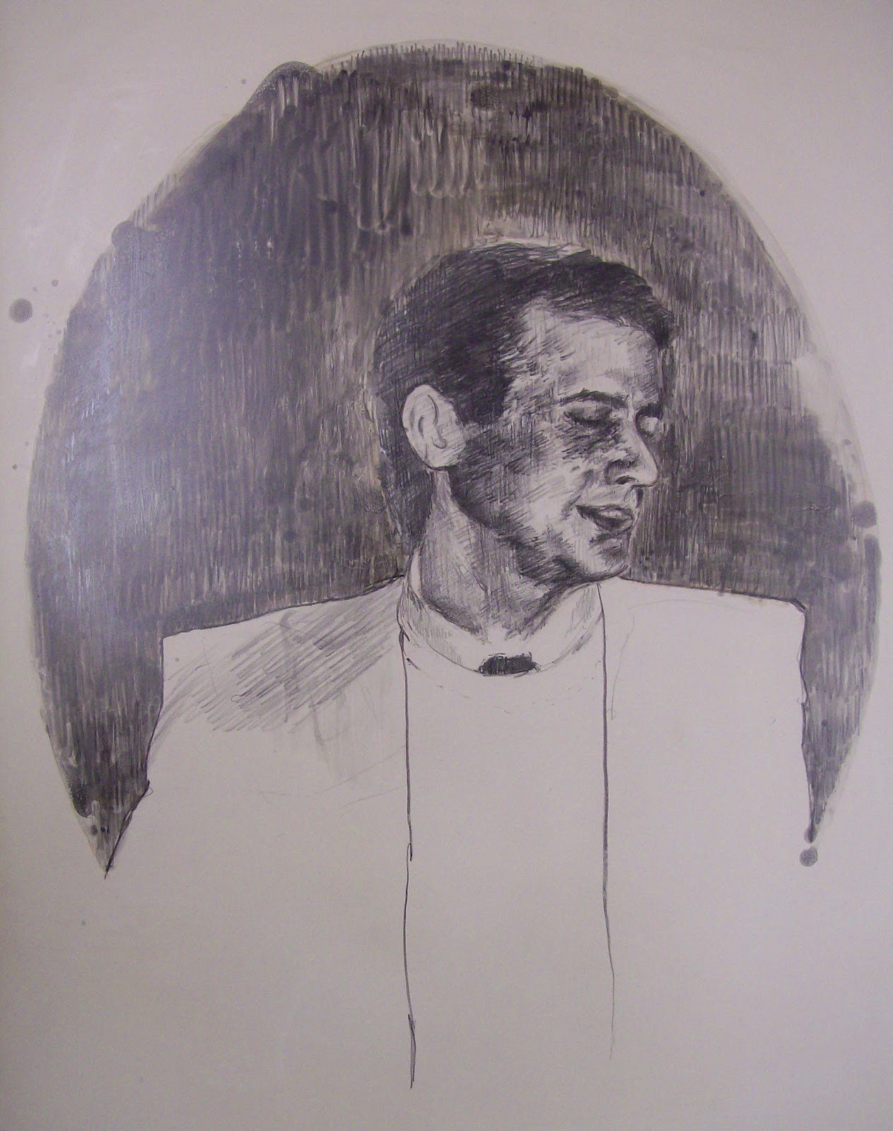

Trial proofing is a time where the artist and printer work together to choose colors, discuss paper options, and (depending if there are multiple plates or stones that make up the image) discuss the order the layers are printed. Joni's image originally consisted of two parts- on one stone she had an image of herself as a child with a floral wallpaper in the background, and on another stone she had an image of her father. Both were executed in an oval shape, which gave the whole thing a very vintage, Victorian portrait kind of feel.
Joni knew she wanted her image on Kitikata paper (a thin, cream, Japanese paper), which meant we still had color and layer order to figure out. Trial proof 1 was executed with the dad in red and the child in green. Because of the vibrancy of the red the green got a little lost, and didn't quite give the brown in the overlap Joni was hoping for.


 | ||
| "Mirror Mirror: Eyes Just Like Your Father" by Joni Tobin |
Next we tried both stones in different shades of black and Joni was much happier with the result, but still felt it needed a little
more. We ended up making two other plates, one for the red in the
roses in the floral background the lips, and one for the green in the
stems and the eyeshadow. She explained to me that her dad used to be a news anchor, and when she was young she went with him once to the studio and witnessed people putting make-up on him before he went on air, and this print represents an exaggerated depiction of that memory.
No comments:
Post a Comment